
About
Client
NYC Leading Nonprofit
role
Freelance UX Designer
duration
2 months in 2021
tools
InVision Freehand
Description
Bowery Residents’ Committee (BRC) is one of NYC’s leading nonprofit organizations providing housing and services to those experiencing homelessness was approaching their 50th anniversary and fundraiser gala in June 2021. There was just one problem, their website.
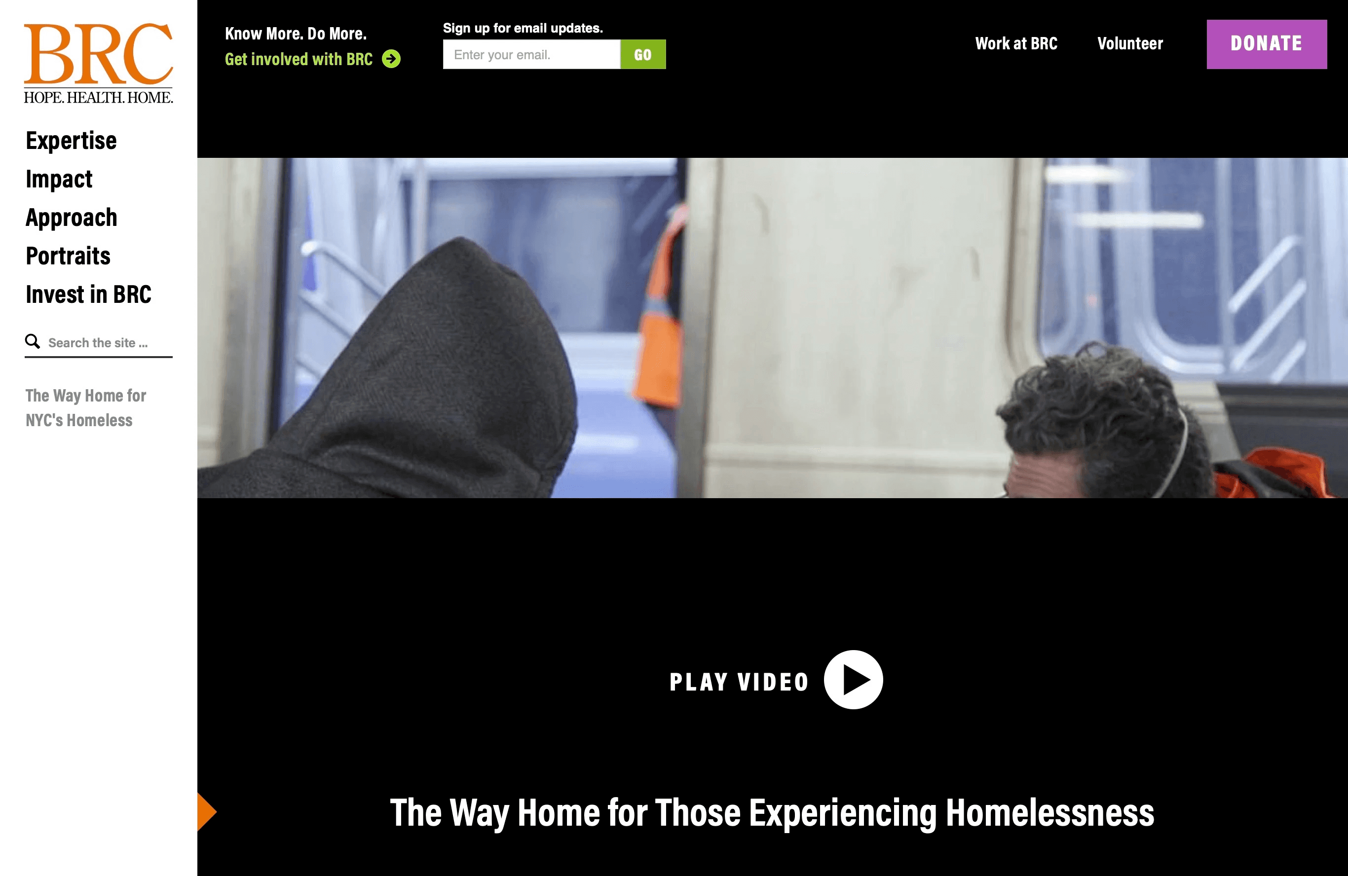
Screenshot of existing site
Challenge
BRC’s staff had limited access to update and maintain their website without coding experience. This later led to inconsistent branding, cluttered pages, and poor navigation, including hidden pages only accessible through search.
My Role
Contracted by Steve Lucin as a freelance UX designer to (1) facilitate user journeys with the client and (2) design desktop and mobile wireframes for a Wix web developer.
Goals
Leading up to the virtual gala,
BRC sought to redesign their website to:
1.
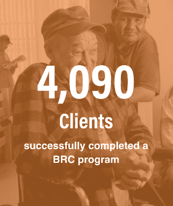
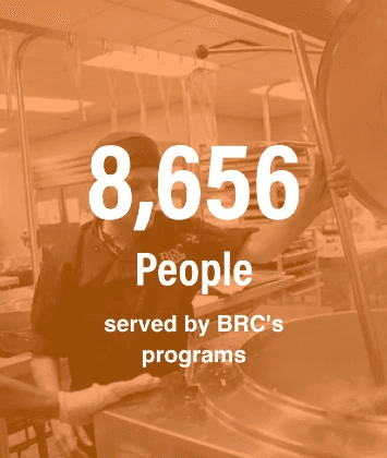
Increase donations and volunteers by highlighting BRC's results-driven approach and success stories
2.
Increase employment applications by showcasing career opportunities
3.
Improve the navigation and organize content to reduce bounce rates and use of the website search
4.
Have a website with a simple and modern look and feel
Where we started
Brand Discovery Sessions
Steve Lucin is an expert at helping businesses and nonprofits rebrand. Part of that process starts with brand discovery meetings, which were held virtually with stakeholders, mainly the Director of Communications and Chief Development Officer. 4 meetings were held to define BRC’s vision, brand attributes and awareness, mission statement, and more. My involvement during these calls focused on the personas and user journeys.
Outlining Personas
Before jumping into user journeys we asked BRC questions to help uncover their ideal personas and identified those personas’ pains and gains. Although there were multiple users that interact with BRC, the three that were chosen focused on the goals highlighted at the start of the project.
Geoffery McKenzie-Bazos, the Tier A Donor
Dela Johnson, the Job Seeker
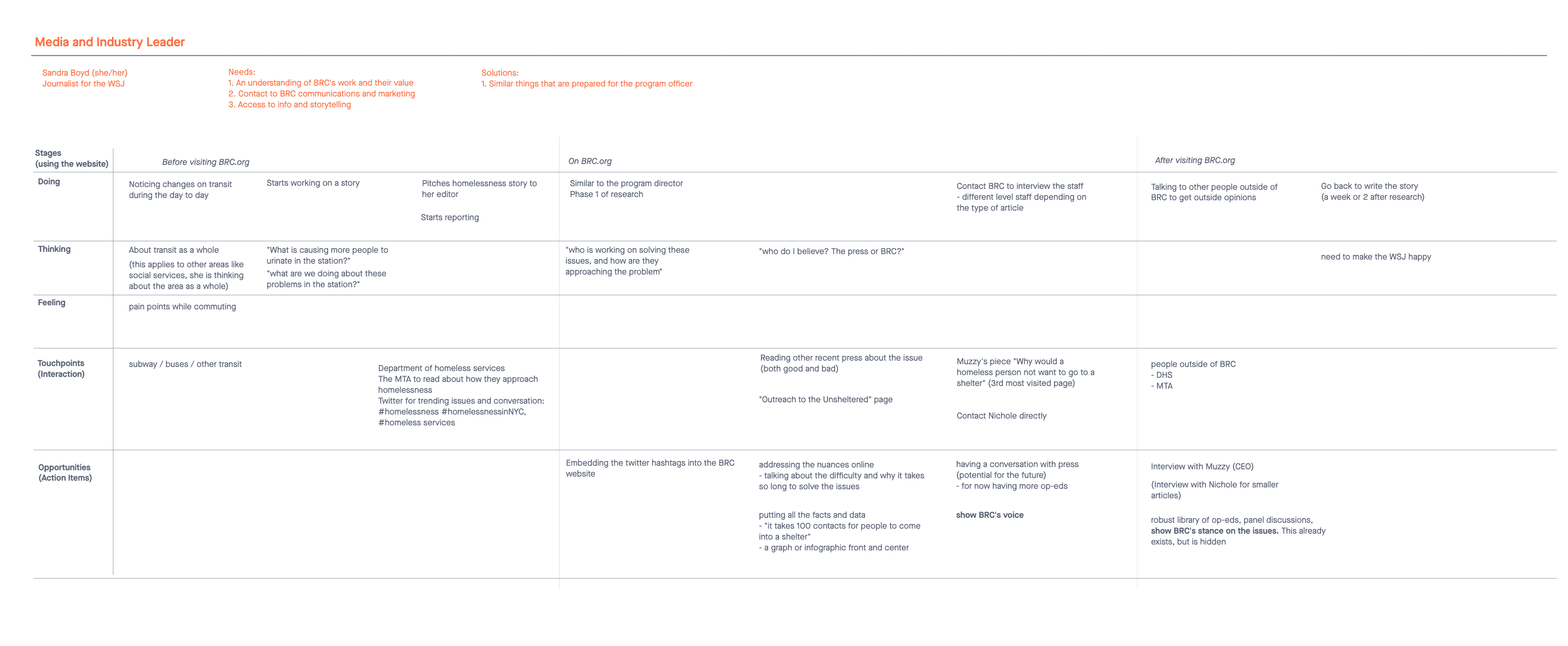
Sandra Boyd, the Industry Leader Journalist
User Journeys
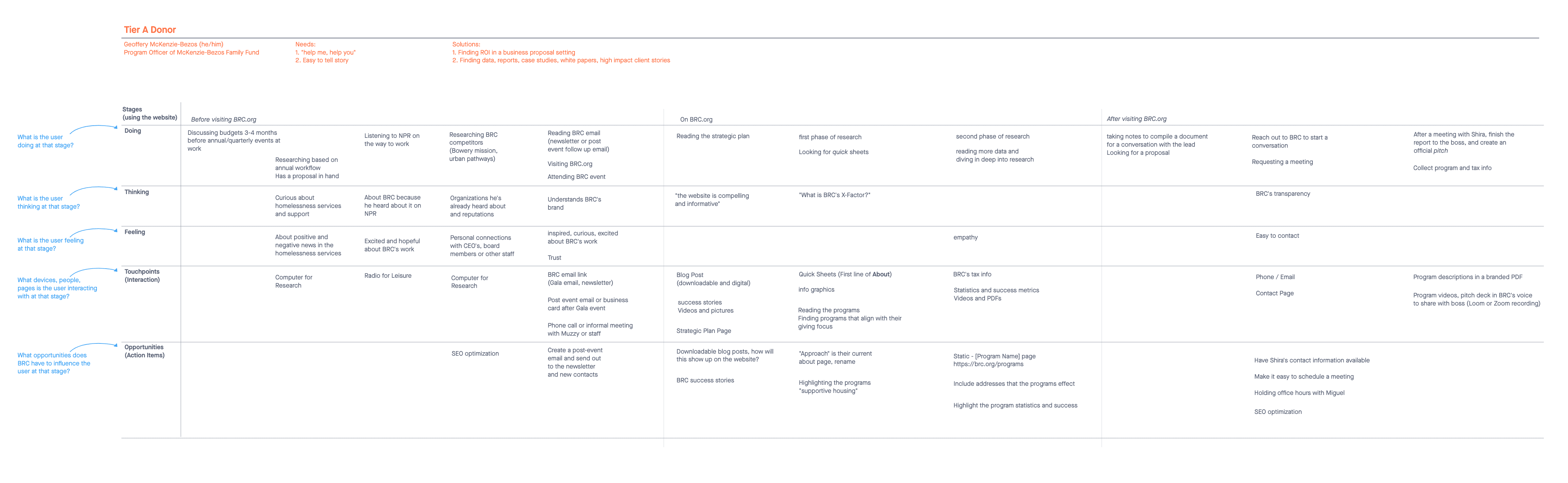
Geoffery the top tier donor
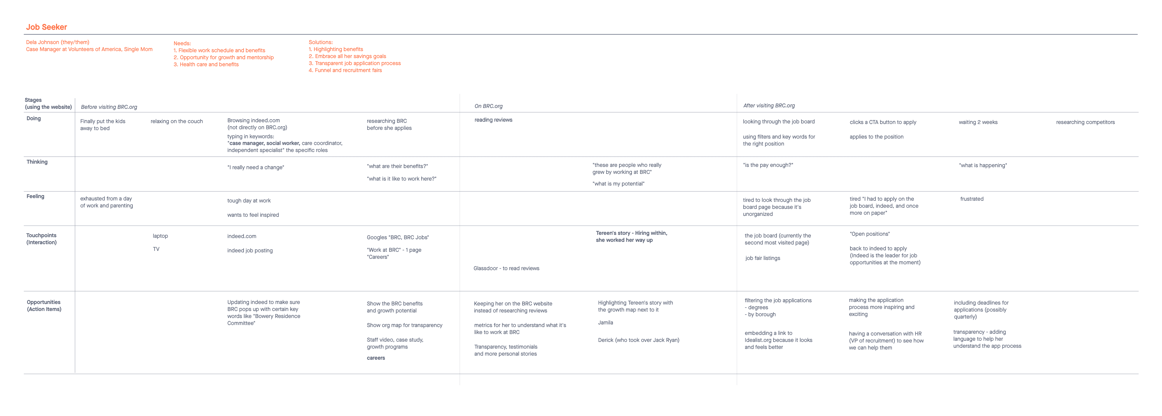
Dela the job seeker
Sandra the journalist
With the personas defined, we decided to use user journeys to identify gaps in the user experience to find opportunities to improve the website. User journeys also helped tell each user’s story from start to finish.
I created a user journey table for each persona. The conversation regarding persona and user journey occurred over different days, so each table recaps the personas name, needs (pains) and solutions (gains). The table moves from left to right, telling the story of each user before visiting BRC’s website, during and after. Similar to creating the personas, we asked BRC questions to help uncover what the user was doing, thinking and feeling at each stage of their journey.
During this exercise, it was important to listen and allow them to speak about their ideal user and ask follow up questions. The challenge was finding the right amount of time on each stage. I realized where we spent the most amount of time discussing was after we found an opportunity and better defined an action item for that touchpoint.
Information Architecture
Existing Site Map
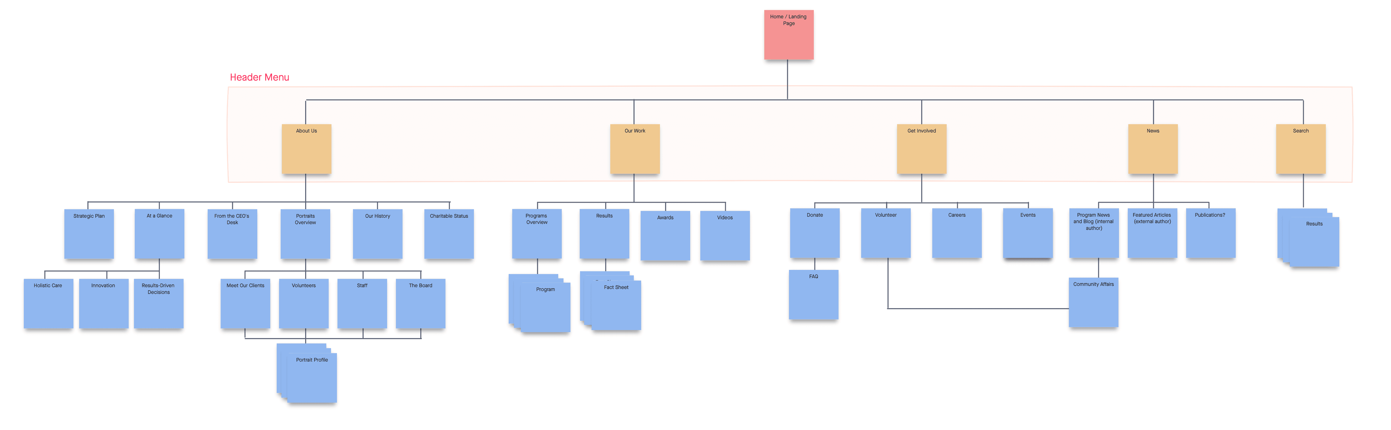
A constraint of this project was BRC’s content and copy were going to be repurposed on the new website. So before approaching the wireframes, I created the existing site map to identify the existing pages. I also noticed two other problems.
Some pages were hidden and only accessible through the search, for example “News”
The site had both a navigation side panel and navigation header with titles that sounded professional, but were difficult to understand in context to the website.
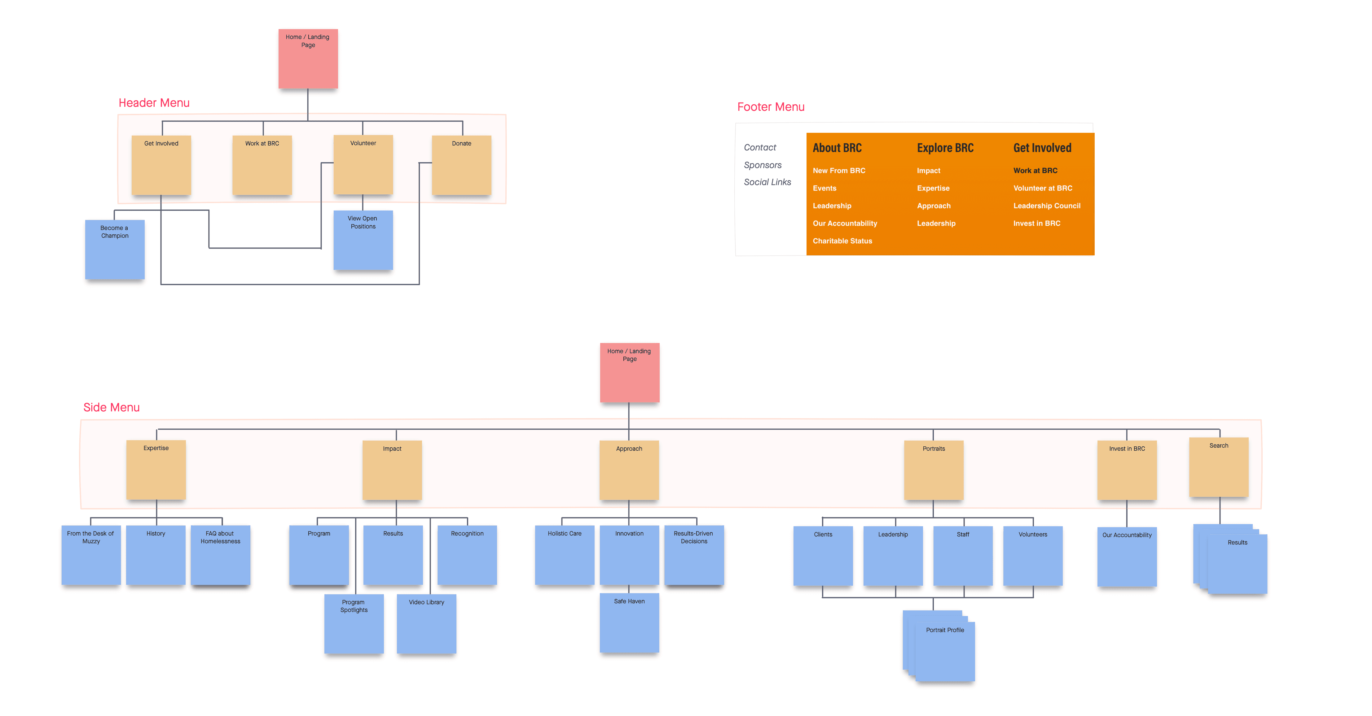
New Site Map
The redesigned site map renamed and reorganized the website pages. For example, “Expertise” was renamed “About Us.” The new site map also focused on information hierarchy. Using the user journeys opportunities, the key pages for each persona are higher up in the map, and more easily found with less clicks.
Wireframes
Header Nav
Desktop
Mobile

Presenting to Stakeholders
I presented virtually twice. The first was a midpoint check-in to receive feedback from BRC and answer any questions. The second presentation was a recorded walkthrough of the completed designs and site map. During the recording I communicated my design decisions and included any details that might be important to consider while viewing the designs. Finding a common time for everyone to meet can be a challenge, so presenting via recorded video message with screen share was an effective way to have multiple stakeholders view and provide feedback asynchronously. This recording also doubled as a great resource for the Wix web developer.
The user journey, site map and wireframes became the foundation for the new BRC.org. Over the past couple years, the site has evolved to include more pages and resources, but some elements from these wireframes still exist today. The results of this projects, lead to redesigning the SteveLucin.com portfolio site.